| Entrance | Mainstreet | Wiki | Register |
|
# of watchers: 9
|
Fans: 0
| D20: 2 |
| Wiki-page rating |  Stumble! Stumble! |
| Informative: | 0 |
| Artistic: | 0 |
| Funny-rating: | 0 |
| Friendly: | 0 |

2010-04-26 [Chel.]: I like the color scheme overall! The dark blue in the wings really grounds everything together.
It seems that you are going for a more realistic figure...thus there are a few anatomical issues. Personally, I think the trunk of her torso should be a little thinner to match up with her arms and leg widths. :)
2010-04-26 [Daisy_Sandybanks]: I agree with [Chel.] I love the color of the wings and the style of the hair. Some of the anatomy needs to be worked on, but overall you've got a good idea going on.
2010-04-27 [Aeolynn]: I agree with chel and daisy, but I also want to add that she feels a bit too... long. XD Sorry that's so short, bedtime!
2010-04-27 [NOOOPE]: I'll make you a red line as soon as I have time... Gotta finish all my projects and shizz first...
2010-04-28 [pegasus1000]: Thanks for the input guys. I was having a hard time figuring out how to do the drapery around the hips without making her look to pear like.
2010-05-17 [arthemis_]: I just like that it's not anatomically perfect. The lean lines of the torso, makes it more surreal. And it's a fairy, who decides that a fairy has to look like a perfect human? ;) I think it's a piece of art, and many great artists don't draw anatomically correct (think Piccasso).
2010-05-17 [NOOOPE]: But there intentionally and unintentionall
2010-05-18 [arthemis_]: I guess you're right. But that is very very hard to do! (thinking of myself and how I suck at anatomy ;)) Even if she intended the anatomy to be more realistic, I find this piece having it's own appeal by not being entirely realistic.
2010-05-19 [Pnelma Tirian]: She has a good profile, but her ear sort of muddles in with the background. Maybe with a darker outline it would pop? The design of the wings and the color scheme is very good. :)
2010-05-20 [The Dizzy Raven]: I absolutely love the wings!! :D Though, the body does seem kind of out of porportion. It could be me however :)
2010-05-22 [pegasus1000]: New pic. Sleepy Foxes
2010-05-22 [Chel.]: Aw! Super cute! :3
I think maybe the eyes are too almond shaped... if that makes any sense?
The noses are a bit flat too. I always have issues with animal muzzles... :P
2010-05-22 [arthemis_]: I love the shading you've done, and without smutches! *hurray* I don't know about the noses, as [Chel.] said, but these are pups, no? Pups have more round faces and not that pointy noses as adult fox, right?
2010-05-22 [Pnelma Tirian]: I like the softness of the foxes in contrast with the gritty black cave.
2010-05-22 [Daisy_Sandybanks]: Awesome picture! Very cute. :)
No real crits to give here, just that I agree with what's been mentioned above.
2010-05-22 [The Dizzy Raven]: hehe cute ^_^
2010-05-23 [pegasus1000]: It took a lot to not get any smutches. Kits do have more rounded faces. The noses do need work. I didn't want to erase once I had the heavy shading on the nose.
2010-06-06 [pegasus1000]: New Picture time. I know it is an older one for me but I actually would like some feed back for it.
2010-06-06 [Chel.]: Snow leapard! Awesome! One thing though that could use clarification.
2010-06-06 [arthemis_]: Maybe the legs can use some work, I've trouble with it's front legs, as one seemed thicker then the other. Also the head is not symmetrical, but that's a point of perspective I'm not really good at.
I simple LOVE the way you made the fur of the leopard. The spots are near perfect and there is actually a hint of fur that I find amazing! The background is marvelous too. I really admire your skills in pencil drawings! Awesome.
2010-06-06 [Daisy_Sandybanks]: Very nice. The only comment I have on this is that the head seems a bit small, and maybe you could make some areas a litlle darker to give it more depth.
2010-06-06 [Pnelma Tirian]: I like the rocks in the background, but the grass and ground could use a lot of work, particularly the base of the grass. It needs resolution there where it touches the ground. Also, the shadow underneath the leopard should be beneath his belly as well as under his feet.
2010-06-07 [pegasus1000]: First I would like to thank you all for you comments. It will be remembered when I go to draw my next furry creature.
Now to answer some of your comments. The part between the leg and the belly is just that. Cats hindquarters are just weird with that extra bit of skin. I really do agree that the face looks flat especially with the nice depth I have on the body.
The grass is a story in itself. I started drawing it and once I was about half way done I had a “Oh Crap” moment when I remembered that I was drawing a Snow leopard not a jungle leopard, so I started on the rocks. In retrospect I should have kept going with he grass and tried blending it in… Then again I would probably be worried about losing the leopard. Any help here of what would be best would be great.
2010-06-07 [arthemis_]: Lose the grass all together, and make like 'little rocks' to make the ground snowy. Maybe add snow on the big rocks. Cat's hindquarters are indeed weird like that, but maybe add some spots to the 'lumb' too?
2010-06-10 [pegasus1000]: Thanks for the idea [arthemis_]
2010-06-19 [pegasus1000]: New picture.
2010-06-19 [Chel.]: Oh! Pretty scales! I would not have the patience to do that! One thing though, the face/head sort of looks like it's melting?
2010-06-19 [Pnelma Tirian]: The head is just a little bit squashed, that's all. It could be a little longer, but her expression is beautiful. Her tail fin is very delicate and frilly; I like that. :D
2010-06-19 [arthemis_]: I think she is holding her head to the side, but if you look fast, it does indeed seem her right (left for us) side is a bit lopsided. Also her tail, doesn't seem right to me. For me it looks like she starts to have a full tail, then a split tail and then a full tail again... Or is that just me?
I love the scales, the color on them is marvelous, also the fin is very 'fish-like' which is a hard thing to do. I also like how you did the left (right for us) arm, a little behind the body. The right (left for us) hand is also cool (I hate drawing hands). Total picture: 7/10 :D
2010-06-21 [Eyonic]: only thing i have a problem with, as said above, the head does look a little on the squashed side
2010-07-13 [pegasus1000]: new
2010-07-13 [Aeolynn]: Overall, I think this would look good with a lot more work. If you look closely, you can see that their head shapes are off (More round then they should be), and the perspective isn't correct either.
I think it would be better if you redrew this, focusing on the perspective, suggested lines (marked with shadows) and more wispier hair. Your moms hair is more wavy then lines, you should have fun with those long sweeping shapes
Don't be afraid to spend more time on the linework
2010-07-14 [Pnelma Tirian]: definitely work on the shapes of the heads; try drawing a silhouette of them first.
2010-08-25 [pegasus1000]: New
2010-08-25 [Chel.]: Definitely an improvement from the last one! The figures look more natural and not as squashed as in the first attempt! ;]
2010-08-25 [Aeolynn]: poses look more natural, and they both look a lot happier
2010-09-24 [pegasus1000]: New
2010-09-24 [Aeolynn]: the angle of the face seems a bit awkward to me... and the size is a little too small
2010-09-24 [Chel.]: I think the foreshortening needs some work. Did you use a reference? It may help.
2010-09-25 [pegasus1000]: I used a REALLY old art book. Foreshortening is something I am still working on. Thanks.
2010-09-25 [Chel.]: Outstretched legs and arms towards the camera were always the hardest :[
2010-10-01 [Ravendust]: This isn't a bad piece of art, a few things that could be worked on, but all in all pretty decent :)
Feet and hands were always the hardest thing for me to draw- still are. I try to shortcut whenever I can to get out of doing anything with them- not the best solution to the problem^^;;
2010-10-02 [Daisy_Sandybanks]: I agree on the feet and hands. They are always hard todraw, and take a lot of practice to be able to get them down just right. I still have a hard time with them even.
I like her pose, it's very relaxed. Same goes for the colors.
Her neck is bothering me though too, you have pulled too far forward. I think if you erased some of the jaw line and had the neck line go up a little further, it'd look more natural.
2010-10-03 [pegasus1000]: I drew the Face first and then decided on the pose. By then it was to late to fix the neck.
2010-10-24 [pegasus1000]: New. The scanner really over flashed this one
2010-10-25 [Aeolynn]: I really like the wings, but the pose is a bit too generic for my taste... also the head is tiiiiiny, try making that a little larger. If you look at her shoulder, then her head, they appear the same size, head is bigger!
2010-10-25 [Pnelma Tirian]: the pose and clothwork are great! But I have to agree with Aeo, that head and hand--so tiny!
2010-10-25 [pegasus1000]: This was one of my first profile poses. But I like the comments so far.
2010-10-25 [Eyonic]: I'd have to agree as well, the head does seem a tad bit small. the way i learned to do the proportion of the head to body is that the body is usually 5-6 heads tall :/
2010-10-27 [Ravendust]: Gorgeous wings, and the pose is well done, though as others have said her head is tiny.
2010-11-08 [pegasus1000]: New
2010-11-08 [Eyonic]: I am confused about the light blue part behind the tail..
2010-11-09 [pegasus1000]: I didn't want a white background so I went for a "watery" blue.
2010-11-09 [Aeolynn]: i think eyonic is talking about the blue fin thing, doesn't look like its attached to the tail
2010-11-09 [pegasus1000]: oh. I thought the tail needed more to it then the dark blue part.
2010-11-10 [Eyonic]: ah okay
2010-11-20 [Ravendust]: pretty decent, her face (eyes, nose mouth at least) is a little small for the head though, and I think that the fins may be a little too slender, but she looks good :)
2010-11-23 [pegasus1000]: Thanks. It is the only time I have drawn a face in that pose.
2010-11-23 [pegasus1000]: New. The scanner was broken so this is a picture of the picture.
2010-11-23 [Chel.]: Cute little interaction here! Crit: The black is a bit harsh and distracts from everything else. Either add black on other places or don't use it.
2010-11-23 [pegasus1000]: Thanks.
2010-11-23 [Eyonic]: I would have to agree, the black does stick out a bit compared to the other lighter colors.
2010-11-24 [Ravendust]: cute piece, the black does indeed distract the eye from the image as a whole, but its still pretty neat :)
2010-11-24 [pegasus1000]: What other color would you make the stripes??
Or
Where else would I add black to make it not so distracting??
2011-01-03 [pegasus1000]: NEW. Cardinal
2011-01-05 [Ravendust]: interesting, I think for the way its sitting its a little too round though, either that or the wing isn't very proportionate to the body...
2011-01-05 [pegasus1000]: Did you just imply that my bird is fat??? lol. Just kidding I can see what you say in the body being a little round.
2011-01-05 [Aeolynn]: Well, naturally cardinals live in cold weather, and to survive they puff out their feathers for warmth
2011-01-05 [Ravendust]: yes, at the same time though if the feathers are puffed up, its not really noticeable in this
2011-01-05 [Aeolynn]: *shrugs* he looks cold to me lol
2011-01-05 [Eyonic]: it's not fat, just pleasantly plump! Looks great!
2011-01-08 [pegasus1000]: New: Blue Jay. I love little birds.
2011-01-09 [Daisy_Sandybanks]: Very nice! I love it. Was it done in watercolors? The only critique that I can think of, is that the head might be a bit big. Other than that though, you did an awesome job with this piece. :)
2011-01-09 [Eyonic]: either the head is a tad bit big or the legs are too small.... good though!
2011-01-09 [pegasus1000]: color pencil: It's funny, but I am not that great with paint.
2011-01-10 [Aeolynn]: This is honestly, the best work I have seen from you yet. Bravo!
2011-01-10 [pegasus1000]: Thanks.
2011-01-11 [Ravendust]: the bluejay looks really good- though angry xP
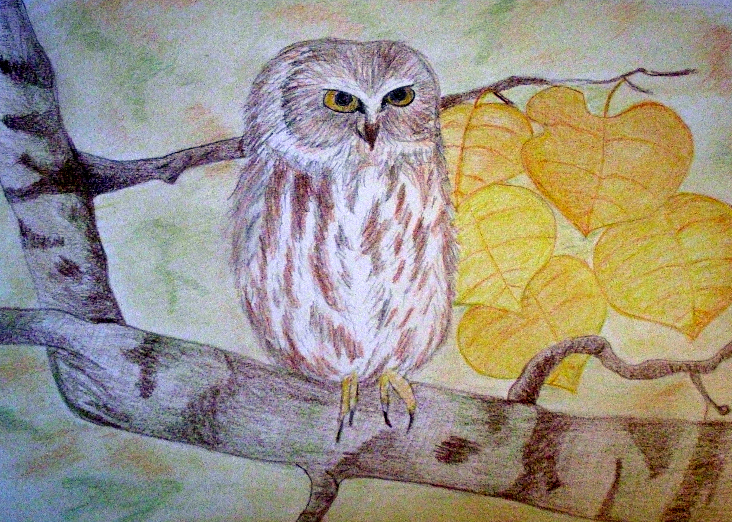
2011-02-10 [pegasus1000]: new. For some reason I am stuck drawing birds.
2011-02-10 [Daisy_Sandybanks]: Very nice! I love the colors.
2011-02-11 [The Dizzy Raven]: The owl is so adorable! You definitely did an awesome job here!
2011-02-11 [pegasus1000]: Thanks.
2011-02-11 [The Dizzy Raven]: you're welcome :3
2011-02-12 [Ravendust]: I like! :) And hey, who says being stuck drawing birds is a bad thing? xP
2011-02-18 [Eyonic]: so cute and fluffy!
2011-04-27 [pegasus1000]: new
2011-04-28 [Eyonic]: i really like those wings!
2011-04-28 [Ravendust]: I agree, its very neat :)
2011-04-28 [The Dizzy Raven]: That's cute!! :D Adorable design ^_^
2011-05-04 [pegasus1000]: thanks. It took a while to remember how to do butterfly wings.
2011-05-04 [The Dizzy Raven]: butterfly wings are rather difficult >.< it's hard to get all those details right
2011-06-03 [pegasus1000]: New
2011-06-03 [Aeolynn]: your proportions have greatly improved
2011-06-03 [pegasus1000]: Thanks, it took me awhile to get the profile proportions but I am glad they are better.
2011-06-04 [Eyonic]: very good on proportions, definitely like the outfit
2011-06-06 [pegasus1000]: Thank you. ;)
2011-06-06 [Ravendust]: Definitely like this piece :)
Dunno why I never got a page change notice though...
2011-07-14 [pegasus1000]: new. Sorry about the bad resolution of the pic.
2011-07-14 [Aeolynn]: I really like the wings and their colors
2011-07-14 [Eyonic]: very nice pose :D
2011-07-16 [pegasus1000]: Thanks
2011-10-25 [pegasus1000]: new
2011-10-26 [Eyonic]: oh i love the color transitions, you did it with color pencil?
2011-10-27 [pegasus1000]: Thanks.. Ya, color pencil has been my new medium. I think this is the best so far for my fairies when I have used color. I did do some editing in gimp that made it look more painted then drawn.
2011-10-27 [Eyonic]: I've been doing a lot of color pencil lately, but that's only because my compy got a little broken so i couldn't open it
find i rather like pencils still though :3
2011-10-29 [pegasus1000]: My normal solution for broken things are either duck-tape or a sludge hammer... I don't think either would work in this case. ;)
2011-11-08 [Eyonic]: no, unfortunately not. the hinge itself is broken, not sure if it even could be fixed
2011-11-14 [Ravendust]: very interesting... The face is a little... stretched looking though, otherwise its amazing :)
2011-11-14 [pegasus1000]: I made the eyes wider then normal eyes so the face looks a little wider then it really is.
2011-11-22 [pegasus1000]: New: Hop A Ride
2011-11-23 [Eyonic]: zomg i wanna ride a froggy! the back leg of it looks a tad bit wobbly though o.O
2011-11-24 [Ravendust]: Very interesting, for whatever reason I'm reminded of Thumbelina xP
2011-11-24 [pegasus1000]: @ Eyonic: Ya, the leg turned wobbly in editing Thanks.
@ Raven: I wasn't really going for Thumbelina but it is a similar premise. Thanks.
2011-11-28 [Eyonic]: i rather like how the wing pattern kinda matches the frog pattern in a way, ties the two together more
2011-11-30 [pegasus1000]: I was trying for that affect. Thanks.
2012-10-19 [pegasus1000]: New: Latch Hook Owl
2012-10-19 [The Dizzy Raven]: Aw!! So cuuuute! <3
2012-10-19 [pegasus1000]: Thanks Mukki
2012-10-20 [The Dizzy Raven]: You're welcome <3
2012-11-03 [Ravendust]: cute :) latch hook was always fun
2012-11-03 [pegasus1000]: Ya, this is my own design. You might be able to count how many times I ran out of a color... Hint: the background and tree limb is speckled for a reason
2012-11-03 [pegasus1000]: you guys might recognize the original drawing:
2012-11-03 [The Dizzy Raven]: :3 Yeah I remember that cute piece
2012-11-03 [Ravendust]: that's awesome, I thought it looked familiar. How do you go about designing your own latch hook?
2012-11-07 [pegasus1000]: I form a super grid and I draw out some of the design. I use the grid as a template...
My next design I actually took the time to color the pattern instead of just gridding and hoping the colors match up.
2012-11-07 [pegasus1000]: I have already run out of green and I am afraid I will run out of blue and peach too. Funny thing is I chose this pattern because I have a ton of extra yarn. (Not enough as it turns out)
2012-11-07 [Ravendust]: that's pretty cool, good luck with the yarn! xP
2013-01-16 [pegasus1000]: New Bobcat
2013-01-16 [Ravendust]: cute, I like it :) The body seems a little disproportiona
2013-01-16 [Eyonic]: super cute! but yeah, that back leg seems off a little :3
2014-01-29 [pegasus1000]: New - Pegasus
2014-01-30 [Eyonic]: The head is a much better size :) did you do the second one with the same materials? looks a bit less shiny-done-on-
2014-02-05 [Eyonic]: ah gotcha :) very nice indeed
2014-09-02 [pegasus1000]: New: Baby Dragon. I know the arm and leg are odd but I still like the color
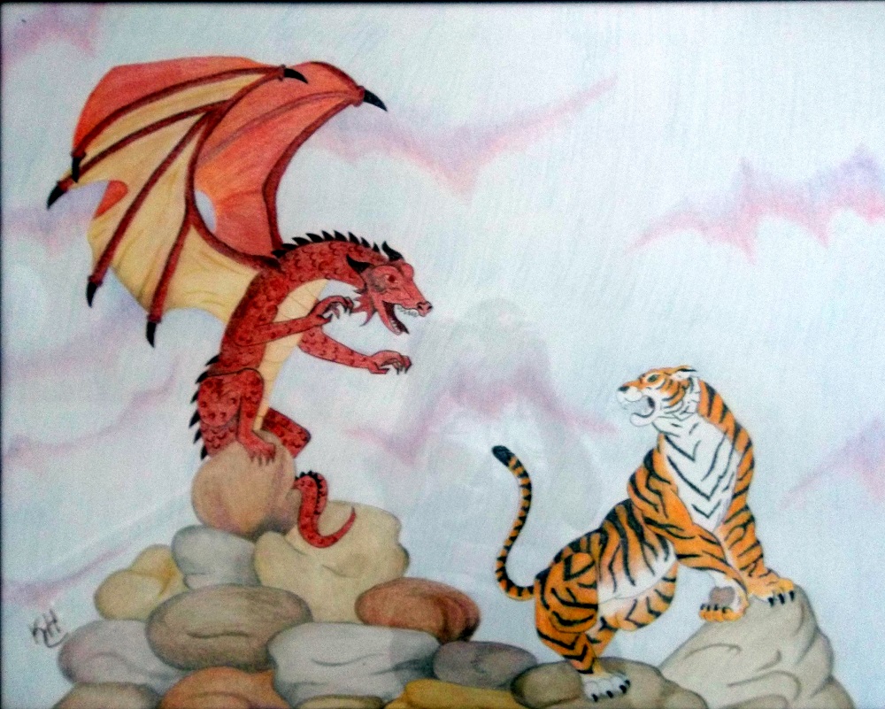
2015-03-10 [pegasus1000]: The Dragon Vs. Tiger.
Hopefully more people start to submit their pictures.
| Show these comments on your site |
|
Elftown - Wiki, forums, community and friendship.
|